Visualising Data with Andy Kirk
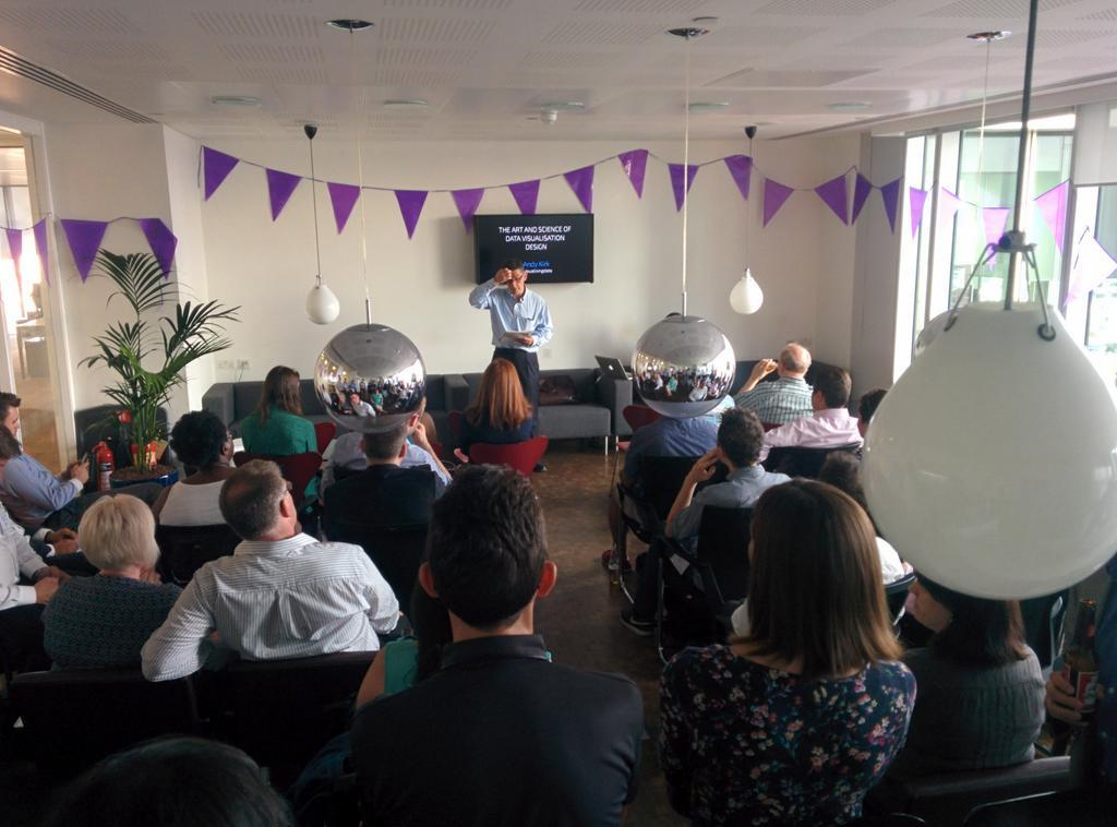
This evening I attended a Visualising Data meetup hosted by the London Business Analytics Group featuring Andy Kirk; a data visualisation specialist. Andy explained his views on tackling data visualisation jobs and the process he goes through when thinking of the best way to convey data in a meaningful way. Data visualisation is large part of my job and seeing Andy go through his techniques of turning data into useful, actionable information was very interesting to see. I very much liked how he explained the hidden art in the amount of decisions made in good examples of data visualisation; every colour and font-size makes a difference.
Talking to Andy after his presentation, he mentioned quite a few tools such as Tableau, RAW, Ometria and RJMetrics but explained how there really is a lack of multi-purpose tools out there for designers. He explained how most visualisation projects start off by passing the data into a tool like Tableau where users can interact with the data quickly to find interesting insights which are then artistically drawn up in Illustrator manually.
Since the meeting I have been reading his book on Data Visualization: a successful design process which gives a brilliant thought-process to follow when working on data visualisation jobs. His views on the balance between art and science really makes a lot of sense and the examples used throughout the book provide a good resource to go back to when brainstorming.